
FICTIONAL PROJECT
Creating a new visual identity for the Swedish app “Skrappen” encouraging users to collect trash others have thrown in nature
We created a new visual identity for the Swedish app “Skrappen”. Skrappen is an app based on the activity of picking up litter in nature and city streets, to help keep our environment clean. The user is able to join events created by the organisation “Håll Sverige Rent”, events created by other users, and create events themselves.
Currently the targeted audiences are mainly schools and authorities. For the redesign we chose to focus on a younger audience (15-19 year olds). As the sender for the app is quite an authority figure itself, which might be discouraging for the selected age group, we decided to keep the app and the sender separated for this project. Instead we gave the app its own graphic profile which to adhere to.
Youngsters believing their parents are no-good for the environment might be inspired to lead a new path ahead for a sustainable future. This is especially evident following the latest updates with the Swedish activist Greta Thunberg and her movement Fridays for Future.
In our redesign our concept is “discretional playfulness”, with which we mean to adapt a playfulness within limits, as to keep a well balanced design. Positive habits are created by triggers, and to reward the user will learn that collecting trash was simpler than expected. We are creating these habits in a visual and playful way that will appeal to the target age group.
Our process, through functions and wireframes
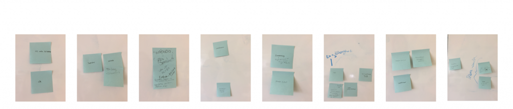
Our process started with analyses of brand identity, target group and surroundings. Thereafter we started working on establishing functions with the KJ-method.
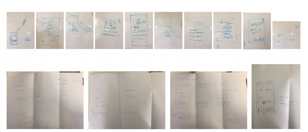
After establishing the functions, we started working on wireframes.
Typography
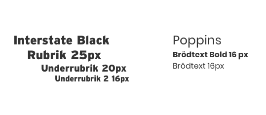
For headlines and buttons the font “Interstate” is used, this is a unique font which works perfectly with the simpler “Poppins” as body font. We chose these fonts as they are easy to read on a small screen, and they balance each other well and go well with our low-key playfulness.
Colours
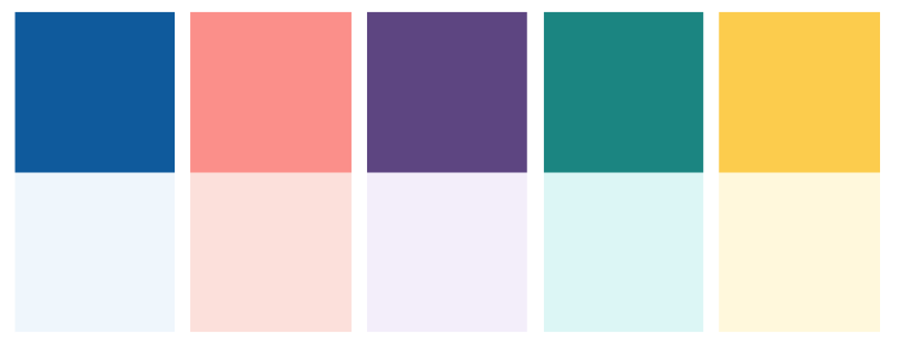
To keep the concept of discreet playfulness we decided to create thematic colours. “Map”, “Register”, “Events” and “Profile” each have their own colour, with a matching background in a lighter nuance.
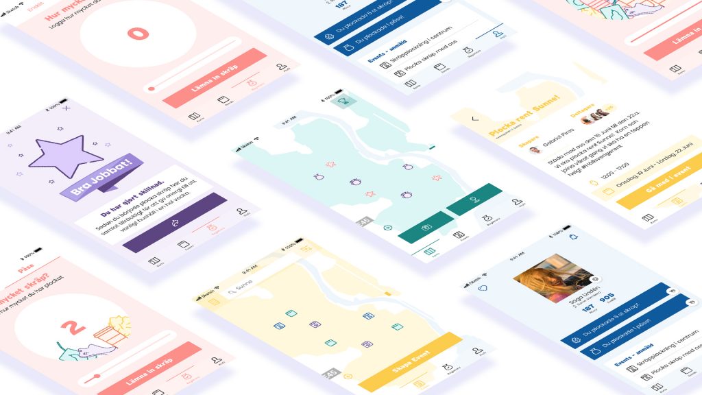
Result
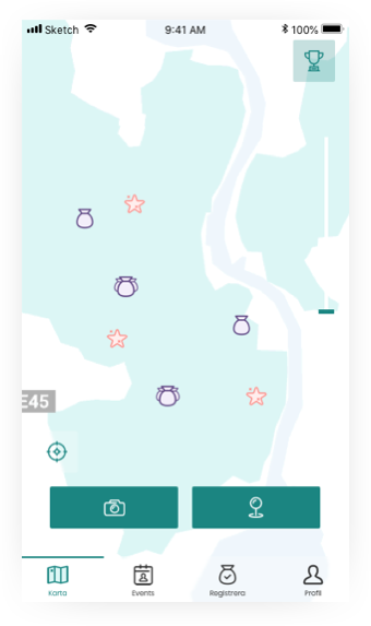
For our start page we decided on a full screen map, where the user is able to tag places that they’ve just cleaned up litter which the user is unable to clean up themselves at that moment. Icons on shows where other users have tagged such places, as well as making it clear for the user that cleaning up trash actually does make a difference, resulting in a higher grade of motivation.
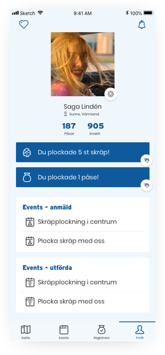

At their profile page the user finds their future and earlier events. It’s also the place where the user finds their updates and activities as well as the people they’ve chosen to follow.
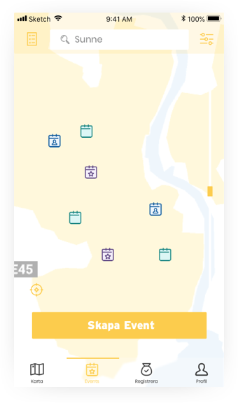
Users are able to join and create events. To make it as simple and fast as possible for the user we decided to display events on a fullscreen map. On this screen the user can easily view the nearest events, as well as searching for events further away. By the press of a button the view will change to a list view instead.
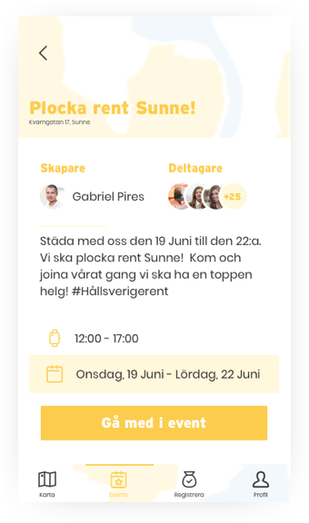
The event function creates feelings of familiarity amongst the users and makes it easy for them to connect.

After the user has collected litter they may register it merely by going to the register screen and swipe the lever until the correct number of trash is selected. The user may choose between items or bags, depending on the quantity of trash collected.
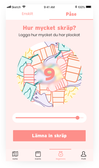
This screen is displayed for the user in a very visual way the amount of litter they have cleaned up, as the circle will be animated, filling up even more for a higher amount.
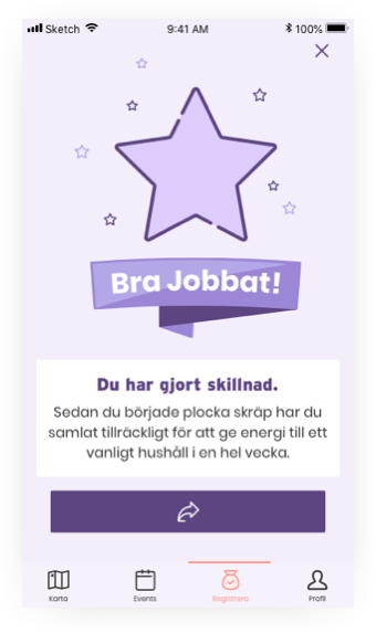
As the user registers trash they will receive a congratulatory screen displaying a message “Well done!” and a fun fact based on the amount of trash collected.
UI-animation
Team
Amanda Bladh, Joona Miettinen & Elin Jonsson
My role
User Analyses, personas, Wireframes, Interaction Design, User Journeys, User Flows, and HTML/CSS.
Time frame
4 weeks, winter 2018